


Wren Kitchens reveals colour mistakes to avoid at all costs
Over the past 12 months, there has been an increase in searches for colourful kitchens, with ‘black kitchens’ leading on a 128% increase and ‘green kitchens’ following close behind at 126%. Although a colourful kitchen can be beautiful, there are many things to consider to ensure you get it right, and one of the most important is colour psychology.
According to the Theory of Colour Psychology and Colour Harmony, colour psychology is important because different colours can have a significant impact on human behaviour. By having an appreciation of the psychological influence of various colours, you can begin to style your kitchen around particular moods and mindsets.
Wren Kitchens have taken a look at what emotions different colours can evoke, the right colours to choose in your kitchen, and what to avoid at all costs!
How to pick the right colour
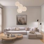
Give your kitchen cool class, with shades of black styled to offer a sense of sophistication and glamour, while contrasting whites can be used to enhance feelings of simplicity, stability, and clarity, perfect for family time. When colouring your kitchen, monochromatic blacks and whites can be combined effectively to offer complementary contrast, and a dynamic cooking and socialising environment.
Additionally, the kitchen is all about experiencing an eruption of senses, whether it be the gorgeous smell of bubbling food or the spectacular taste of your marvellous creations. With this in mind, consider injecting subtle elements of orange, with the bright colour associated with feelings of comfort, food, and fun.
The different emotions
When styling your space, it’s crucial to consider the entire emotional spectrum, and how different colours can influence certain moods:
- Calm serenity
For total tranquillity, choose shades next to each other on the colour wheel. These are called harmonious. Specifically, blues and greens are great for bringing calmness, balance, and equilibrium to your space, while a threatening red is perhaps one to avoid.
- Positivity
Yellow is considered the colour of confidence and self-esteem, and green is associated with fun and frivolity. Reddish hues can also be used to give you feelings of power and excitement.
- Love and romance
You can make use of pink tints dotted throughout, to bring about feelings of warmth, love, and femininity. However, pink is, perhaps surprisingly, particularly potent, so make sure to use shades in moderation.
- Concentration
In an era where remote working has become the norm, it’s increasingly important to have a space that complements your working life. To help build feelings of focus and concentration, combine soft blues, aimed at calming the mind, violets, proven to heighten awareness, and earthy browns styled towards seriousness and supportiveness.
Colour mistakes to avoid at all costs
- Not considering colour hue - A colour is broken down into different tones, and warm and sharp hues stimulate vastly different feelings. It’s important to take this into account when styling your kitchen.
- Forgetting about lighting – Your room can look vastly different depending on whether you have overhead lighting, lamps, or natural light illuminating the space. Make sure you consider how lighting changes your kitchen when you’re deciding on your perfect colour.
- Over-using one colour - The main thing to avoid when decorating your home is over-using colour. This applies to dark, light, and pastel tones, as well as walls, furniture, and features. It is possible to have too much of a good thing, so don’t get blindsided by a colour you love.
- Combining too many colours in one space - Similarly, don’t fall into the trap of combining too many colours in one space. This can be overwhelming and overstimulating. Blending too many moods can also negate the positive impact of colour; determine how you want a room to make you feel and stick to shades that elevate and enhance these emotions.
Darren Watts, Design Director at Wren Kitchens, comments on the importance of colour Psychology:
“The psychology of colour is incredible and understanding the impact varying shades can have on mood is so important. Take a step back and think about how you want your kitchen to make you feel.
“Importantly, when measuring different colours, don’t forget to take lighting, features, and space into account. In terms of the latter, larger spaces are more forgiving and can handle bolder schemes, whereas smaller rooms require a more attentive approach; if in doubt, it always helps to work with a neutral backdrop, that effortlessly accommodates the odd splash of colour.”
For more information about colour psychology, you can visit our blog here.