


Navy Blue Wallpaper: How British Homeowners Are Making the Shade Work in 2026
Navy blue wallpaper has quietly moved from trend to staple in British interiors. The deep blues from Farrow & Ball and Little Greene now rival their bestselling neutrals, and the peel-and-stick specialists are seeing the same shift. The UK range at Livette's, for example, has made its navy blue wallpaper collection one of its most viewed pages for British shoppers this year, with buyers reaching for the shade to finish bedrooms, dining rooms and hallway feature walls. The question most homeowners are asking is no longer whether to try navy, but which navy, in which pattern, and on which wall.
This is the practical answer.
Why navy blue wallpaper suits a British home
Unlike pure black, navy reads as a colour rather than an absence of light. It adds warmth and personality rather than weight. Unlike the mid blues, it holds its own next to the rich wood tones, brass fixtures and cream textiles that define the classic British palette. Add in the fact that the average UK home receives less natural daylight than the equivalent Scandinavian or Mediterranean house, and navy becomes one of the few dark shades that still looks intentional once the lamps come on.
Choose your navy before you choose your pattern
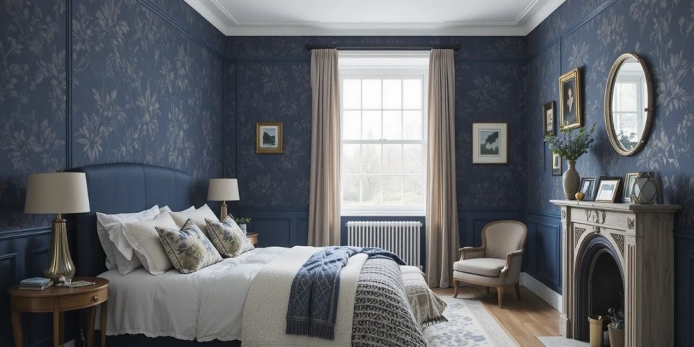
Not all navies behave the same way. Inky navies with a black undertone, sitting in the territory of Farrow & Ball's Hague Blue or Little Greene's Basalt, deliver genuine drama and work best in well-lit reception rooms or north-facing dining rooms where the absorption suits the mood. Softer mid-navies that carry a whisper of grey sit much closer to denim and behave like a true neutral, making them the safer choice for smaller box rooms or rented flats where you cannot risk the room feeling cave-like. Then there is the warmer blue-purple navy, sometimes sold as Prussian or Stiffkey, which has become a favourite for heritage-style papers paired with polished brass. The printed pattern will nudge the undertone further in one direction, so it is always worth pinning three or four A4 samples to the wall for forty-eight hours before committing.
Pattern matters more than shade
A plain navy wall can feel oppressive in a typical Victorian reception room with a single sash window. Pattern solves this almost instantly. Navy floral wallpapers introduce a paler secondary colour, usually cream or soft pink, which reflects light back into the room and breaks up the mass of navy. Navy geometric wallpapers, such as fine stripes, herringbone and small-scale tile prints, add movement without demanding attention and work particularly well along hallways and staircases. Navy panelled wallpapers, which use printed mouldings to imitate traditional British wall panelling, are a clever way to add architectural weight to a flat modern wall without the cost of joinery. As a rule, smaller rooms take smaller repeats. Larger botanicals and damasks suit double-height walls and reception rooms with period detailing.
Think about the wall, not just the room
Feature-wall thinking has matured. Rather than automatically papering behind the sofa or the bed, the stronger instinct is to find the wall with the least natural light, or the one that frames an existing focal point such as a chimney breast, a headboard or a fitted alcove. In galley kitchens and long hallways, papering the end wall in navy draws the eye forward and visually shortens the space, which is often exactly what those narrow British floorplans need.
What colour goes with a navy blue wallpaper
Navy needs warm companions to avoid reading as cold. Brass or unlacquered bronze ironmongery, rattan pendants, oatmeal linen curtains and cream or buttery-yellow accents all lift the temperature. Wood tones matter just as much. Mid oak, walnut and reclaimed pine all warm a navy wall, whereas high-gloss white furniture and cool chrome can make the same wall feel clinical. If you want a more confident look, pair navy wallpaper with gold picture frames or a navy and white striped rug for a coastal-leaning finish. For a softer result, navy and cream is hard to get wrong.
The peel-and-stick option makes it a low-risk move
Roughly a third of British households now rent rather than own, and traditional paste-the-wall navy wallpaper is a difficult conversation to have with a landlord. Modern peel-and-stick options have closed the quality gap to the point where they are effectively indistinguishable from traditional paper at arm's length, and they lift off cleanly at the end of a tenancy. They also make navy a realistic experiment in smaller commitment spots, such as the inside of a wardrobe, the back of an open bookcase or a single alcove, before taking the plunge on a whole wall.
Final thought
Navy blue wallpaper is forgiving once you treat it as a neutral rather than a statement colour. Choose the right undertone, pick a pattern that lets the wall breathe, and pair the shade with warm materials. Those three decisions will do more for the finished room than any amount of accessorising afterwards.