


Present Data Effectively with Powered Template’s Selection of Ready-Made Chart Templates
As we transition towards a society geared towards remote work, it’s becoming more vital for data to be shared and presented in an effective manner. Typically, this means finding the right chart format to share results and to provide clarity on complex issues. For many, this can involve time-consuming chart-building processes and hours of trial and error techniques in trying to find a fitting means of sharing information.
However, it doesn’t have to be this difficult, and with Powered Template’s suite of rich and varied chart templates that can be incorporated into presentations and shared, it’s possible to create engaging visualisations that can be extremely useful for colleagues and viewers alike.
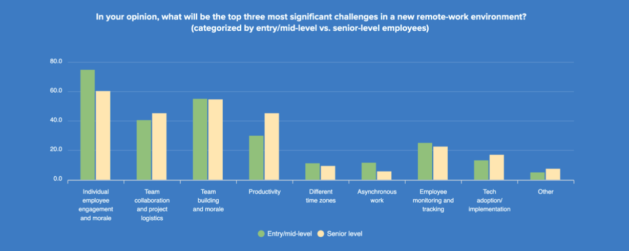
(Image: Workable)
As the chart above shows, the key challenge that managers believe they face regarding their employees across different levels revolves around engagement.
Although managing engagement is likely to require a comprehensive company-wide solution, working to ensure that the content you share during remote presentations can certainly act as a foundation in creating a more switched-on and engaging environment.
The issue with creating eye-catching and easy-to-follow visualisations is that the process can be largely time-consuming without any guarantee of the desired result. Less technologically literate users may find it difficult to even begin to record information within their charts and graphs, whilst others may lack the foresight to convert the information that’s available effectively.
However, platforms like Powered Template can be great for helping users to automatically source the data visualisation and infographic templates required to create engaging constructs using essential information.
With this in mind, let’s take a deeper look into Powered Template’s rich array of pre-prepared and professionally designed data charts for businesses:
Making Data Come to Life
Making data accessible, easy to understand, and manageable is a key challenge for businesses that operate remotely. Fortunately, Powered Template offers thousands of different chart-based designs that can help to bring raw data to life in a presentable and engaging way.
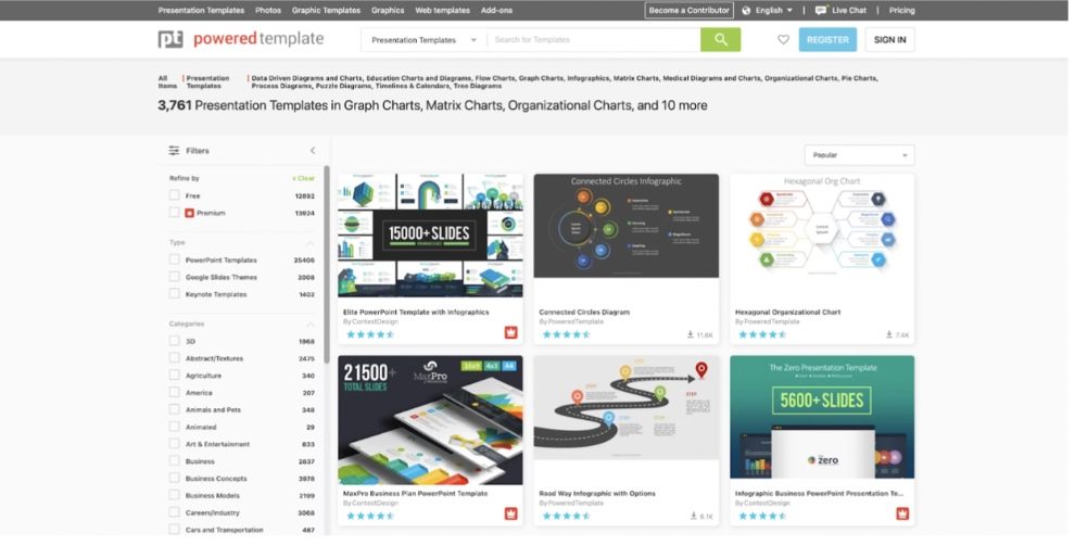
Powered Template features a wide range of chart-based filters for users to quickly find and access the type of visualisation that they’re looking for. As we can see from the image above, the total number of collective chart options ranges to 3,761 templates at the time of writing - with many more business-oriented options available to download.
Different templates can be accessed through the platform’s intuitive menu, which populates the range of results available to users instantly. In total, the chart-based and infographic options for users include data driven diagrams and charts, education charts and diagrams, flow charts, graph charts, infographics, matrix charts, medical diagrams and charts, organisational charts, pie charts, process diagrams, puzzle diagrams, timelines and calendars, and tree diagrams.
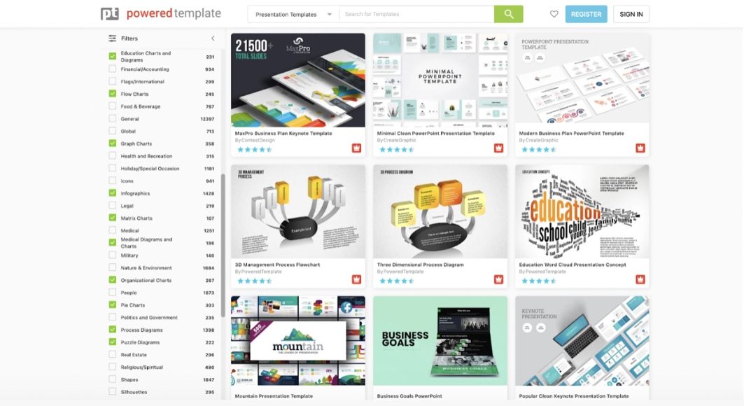
Furthermore, it’s possible to further refine results based on the total number of slides each selection possesses, the aspect ratio of the templates, and factors surrounding the layouts, use of images, included fonts, and editable shapes available.
Another important consideration to make is choosing between a premium or free template. It’s possible to see which templates are free and which are reserved for subscribers by checking for the red thumbnail in the bottom right corner of each template.
Although Powered Template features more than 25,000 presentation templates, as many as 12,800 are available completely free for users. There’s even no requirement for a sign up to occur. The only thing that Powered Template requires in return for a free download is an appropriately positioned attribution on the edited version.
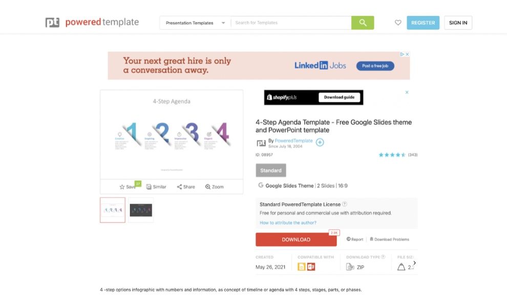
Let’s take a closer look at one of the designs available for users to download. The example above is actually a free download which users can simply access following an appropriate attribution.
One of the first things that it’s important to observe is that there are some excellent social proofs encapsulated in Powered Template’s theme pages. On the top corner of the ‘Download’ button, we can see that 2,900 users have already downloaded the theme, whilst the item has received an average 4.5-star rating spread across 343 reviews.
The data conveyed in the theme page indicates the date that the item was created, the file format, and the different platforms that it’s compatible with.
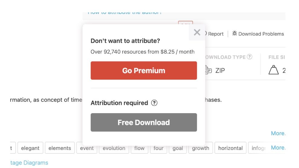
Once you’ve decided that you would like to download a template, you’ll be given the choice of whether or not to download for free with an attribution, or to use a premium subscription for a download without the need to attribute.
There are many options available for users to utilise a premium subscription, and a yearly subscription equates to around $8.25 per month at $99. Alternatively, a one-month subscription comes in at a cost of $19.
Alternatively, Powered Template offers an ‘On Demand’ service that allows users to pay only for the downloads they select, and purchases of 10, 20, 50, and 100 downloads can be arranged to be redeemed at any time over the course of a year.
In the age of remote work, presenting data effectively and efficiently has become an art form in its own right, and through Powered Template’s free and premium quality selection of themes and presentation templates, a time-consuming process can be made straightforward with an abundance of choice and fully customisable slides.