


How Colour Became the Most Powerful Tool in Modern Event Styling
Event styling has become increasingly sophisticated, but one of its most effective tools is still colour. A carefully chosen palette can connect clothing, flowers, lighting, table settings, stationery, photography, and even the surrounding architecture without requiring every detail to match perfectly. colour also communicates mood before guests consciously register any specific design element. Whether an event feels romantic, dramatic, playful, minimalist, or luxurious often begins with the palette.
Metallic Light Works Almost Like an Accessory
Fashion designers understand how metallic details catch light and create movement, and event styling can use the same principle. Wedding sparklers introduce warm, flickering points of light into a beautiful goodbye, creating an effect that works almost like temporary jewelry for the scene. The light complements formalwear, photographs, and evening settings without requiring another permanent decorative element. It is a good example of how event colour does not always have to come from fabric or flowers.
The effect also changes as people move. Unlike a static gold centerpiece, sparkling light shifts constantly and interacts with clothing, faces, and the background. That movement can make a formal event feel more alive. Modern styling increasingly considers these temporary visual effects alongside conventional décor.
When colour Carries the Entire Message
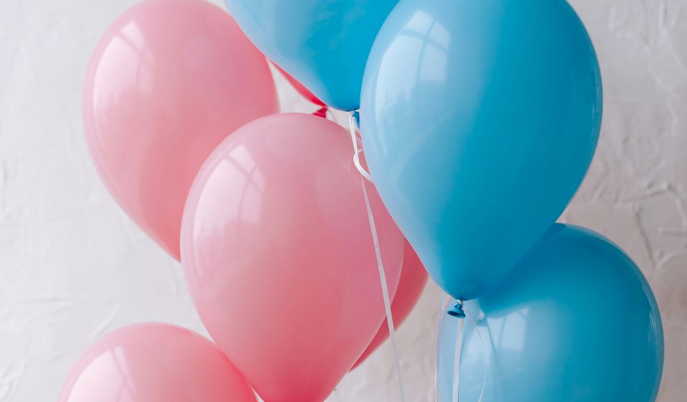
Some events use colour as decoration, while others use it as communication. A gender reveal fire extinguisher creates a moment in which the colour itself delivers the announcement. Guests understand the message before anyone needs to explain it. That makes colour both an aesthetic element and a storytelling device.
This idea extends well beyond pregnancy announcements. Brands use colour to communicate identity, weddings use it to distinguish different moods or settings, and cultural events often rely on established colour symbolism. When colour is carrying meaning, designers need to be especially intentional about surrounding elements. Too many competing tones can weaken the visual message.
A Strong Palette Begins With the Setting
Choosing colours before considering the venue can create unnecessary design problems. A palette that looks beautiful on a digital mood board may clash with carpet, walls, architecture, or the natural environment. Professional-looking event design begins by treating the venue as part of the palette. Existing materials and colours can either be incorporated or intentionally contrasted.
Outdoor events make this especially apparent. Desert landscapes, gardens, beaches, forests, and city rooftops already contain dominant colours and textures. Working with those surroundings often produces a more sophisticated result than trying to overpower them. The setting becomes the largest design element in the room.
Clothing Is Part of the Event's Visual Composition
Fashion and event design are no longer separate conversations. Couples increasingly think about how wedding-party attire will look against flowers, décor, architecture, and photography backdrops. Guests may also receive dress-code guidance that supports the atmosphere of the event. This does not necessarily mean requiring everyone to wear one exact colour, but it does mean thinking about clothing as part of the visual experience.
The strongest styling usually creates harmony without looking overly controlled. Bridesmaid dresses might use related tones rather than identical shades, while suits, accessories, and flowers repeat portions of the palette. Variation keeps the event feeling human. Perfect uniformity can sometimes look more like a production than a celebration.
Monochromatic Design Can Create Depth
Using one colour family does not have to look flat. In fact, monochromatic styling can feel particularly sophisticated when designers vary shade, saturation, texture, and material. Cream may appear as linen, flowers, candles, paper, and stone, with each surface reflecting light differently. The eye perceives consistency without boredom.
This approach is useful when an event needs to feel polished but not visually busy. It also allows clothing and people to remain prominent because the background is cohesive. Rather than asking how many colours should be added, designers can ask how much variation can be created within one family. Restriction can actually generate creativity.
Contrast Creates Energy
While monochromatic palettes produce calm, contrast creates drama. Dark suits against a light venue, bright flowers against neutral linens, or jewel tones against metallic accents immediately draw attention. Contrast can help direct the eye toward important areas such as a ceremony backdrop, stage, cake table, or entrance. It gives the design visual hierarchy.
The key is deciding where that energy belongs. If every part of the event uses maximum contrast, nothing feels especially important. Designers often reserve the strongest combinations for focal moments and allow supporting areas to remain quieter. This mirrors fashion styling, where one statement piece works best when everything else allows it to stand out.