




How to Design a Christmas Jumper You'll Actually Want to Wear
It's easy to start a Christmas jumper design in the wrong place. You open a blank canvas and immediately reach for snowflakes, reindeer, holly, red-and-green colour palettes or an AI prompt full of festive clichés. Within minutes, you have something recognisably Christmassy. The harder question is whether you have anything worth wearing.
The familiar Christmas jumper in this context is really a printed sweatshirt, which gives you a large, simple surface to work with. That does not mean you need professional design skills or a complicated illustration. In most cases, the strongest starting point is an idea that feels specific to the person, group or occasion, then a line or visual concept that expresses it clearly.
The useful order is simple: find the idea first, work out what you actually want to say, refine the wording and only then decide how it should look. Design tools can help with execution, but they become much more useful once you already know what you are trying to create.
Start with something only you would think of
Generic Christmas imagery is easy to find because everyone recognises the same visual language. A Santa hat, a string of fairy lights or a reindeer silhouette can make a sweatshirt look festive, but none of those things gives the design much personality on its own.
A better place to start is with the wearer. Think about the details that would make somebody immediately recognise themselves in the idea: a hobby they never stop talking about, a job everyone teases them about, a family phrase that appears every December, a pet with a ridiculous habit or a Christmas tradition that has somehow become compulsory.
The same principle works for groups. A workplace design doesn't need to rely on a generic office joke if there is a much better running joke only the team understands. A family sweatshirt does not have to say "Christmas Crew" if an embarrassing story, phrase or ritual has been repeated for years. A group of friends may have a shared holiday disaster, favourite saying or personality trait that gives the design a much stronger point of view.
Personal does not have to mean sentimental. In fact, some of the most useful material is funny, specific or slightly ridiculous. The point is simply that the idea comes from something real rather than from a library of festive symbols.
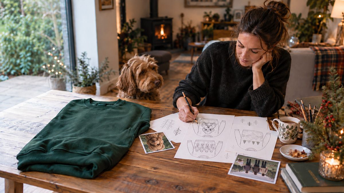
Before opening any design software, write down five to ten observations, phrases or possible angles. They do not need to be polished. You might write "Dad falls asleep before Christmas dinner", "Mum controls the thermostat like a military operation" or "the dog steals wrapping paper every year". Those are not finished slogans, but they are much better creative material than "something with a snowman".
The exercise keeps the focus on the idea before the decoration. Once you have several possible directions, ask which one is distinctive enough to survive the next stage.
Get the words right before you worry about the artwork
A strong line can work with very little visual help. A weak line usually doesn't improve just because it's surrounded by more illustration.
That makes wording one of the most important parts of the process. The first version is rarely the best one, so treat it as raw material rather than finished copy. Try shortening it, changing the rhythm, removing explanation and finding the version that sounds most like the person or group it is meant for.
"Christmas calories don't count" is recognisable, but it could belong to almost anyone. A line built around a particular family habit, profession, hobby or joke has more character because you can't simply swap it onto somebody else's sweatshirt without losing something.
Brevity helps too. A sweatshirt is not a paragraph. If a joke needs three lines of explanation before it makes sense, it probably needs another round of editing. Read the wording aloud and listen for where it drags. Often one unnecessary phrase is the difference between something that feels sharp and something that feels over-explained.
It is worth writing several versions before choosing one. If the initial thought is "Mum runs Christmas like a military operation", alternatives might push the joke in different directions: "Christmas Command: Mum", "Under Mum's Christmas Orders" or something even more specific to the family. Most versions will be worse than the original, which is fine. The point is to explore the idea rather than settling for the first wording that appears.
AI can help at this stage, but it works best as a brainstorming partner rather than the author. Give it the actual details: who the person is, what the running joke involves, what tone you want and what you want to avoid. Ask for multiple directions rather than one finished slogan, then reject most of them and combine or rewrite the useful fragments in your own voice.
Decide what the idea needs visually
Once the wording works, the next decision is not "how do I make this look impressive?" but "what does this idea actually need?"
Sometimes the answer is very little. A strong line set in good typography can be enough, particularly if the humour or personality comes from the wording itself. Other ideas may benefit from an illustration, photograph, retro graphic, deliberately tacky festive styling or a more minimal treatment.
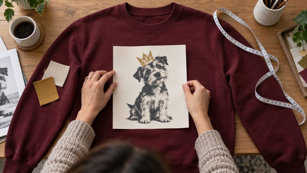
Complexity is optional. A clever phrase in bold type may be stronger than a highly detailed Christmas scene that distracts from the joke. Equally, some concepts depend on the visual. A pet photograph wearing a badly drawn crown, an old family image treated like a vintage festive poster or a deliberately over-the-top retro graphic may be exactly what gives the idea its character.
The visual treatment should therefore reinforce the angle you already chose. If the idea is dry and understated, a loud cartoon treatment may fight against it. If the joke is intentionally ridiculous, restraint may remove half the fun.
AI image generation can help non-designers by creating a polished visual style that would otherwise be difficult to produce manually. The limitation is that exact lettering still deserves careful checking. Spelling, malformed characters, inconsistent spacing and odd visual artefacts can appear even when the overall image looks convincing at first glance.
A safer approach is often to generate the illustration or visual concept separately, then add important wording as editable text afterwards. That keeps control over spelling, font choice, alignment, scale and colour, and it makes later changes much easier.
Once the idea, wording and visual treatment are working together, the next question is how the design behaves on an actual sweatshirt.
Design for the sweatshirt, not an empty rectangle
Once the idea works on its own, the next step is thinking about how it translates onto the garment. Colour, placement and scale can completely change a design's character: a small piece of typography across the chest creates something very different from an oversized illustration or photograph.
Creating personalised sweatshirts also means treating the sweatshirt colour as part of the design itself, rather than an empty background onto which finished artwork is simply dropped. A pale design may disappear on a light sweatshirt, while a strong central image can feel far more dominant once it is enlarged across the front.
For more confident creators, the garment colour can sometimes become part of the artwork itself. If an area of a design matches the sweatshirt closely, that part may be removable so the fabric supplies the colour instead. It can create an effective negative-space result, but suitability depends on the artwork, garment and printing method, so it is worth checking with the printer before building the whole design around the technique.
Make the file easy for a printer to work with
The final stage is less glamorous, but it can save a good idea from being let down by a poor file.
If artwork is intended to print at around 25 cm wide, roughly 3,000 pixels across is a useful target. Supply the original exported artwork rather than a screenshot or an image copied from social media, and use a sensible format such as PNG. Where the design should sit directly on the garment, a transparent background is usually preferable.
“One of the biggest mistakes is judging artwork by how it looks on a phone or laptop,” says Matt Brussels, founder of The T-Shirt Bakery. “Something can look perfectly sharp on screen and still fall apart when it’s enlarged for print. AI is brilliant for getting ideas moving and creating artwork people might not otherwise be able to make, but you still need to check the file — especially the resolution, background, fine details and any AI-generated text.”
AI upscaling can sometimes help when an image is too small, but enlargement isn't a guaranteed fix. Check lettering, edges, faces and fine details afterwards rather than assuming the software has solved everything.
Background removal deserves the same caution. If repeated attempts are starting to damage hair, fine edges or other details, stop and ask the printer whether they can prepare the file instead. Likewise, if you are unsure whether the resolution, transparency or layout is suitable, asking for a quick check is usually more sensible than guessing.
Clever beats complicated
A Christmas jumper does not need the most elaborate illustration, the newest AI tool or the greatest number of festive effects to feel original. It needs an idea with enough personality to deserve the space.
Professional design skills can polish the execution, but they are not the only route to something distinctive. What matters more is knowing what the design is trying to say and resisting the urge to bury a good idea under unnecessary decoration.
The real creative advantage comes from recognising the joke, habit, person or shared experience that nobody else would have thought to put on the sweatshirt in the first place.